ANNOUNCEMENT | 01.14.2025
Click on the photo to enlarge or see more images
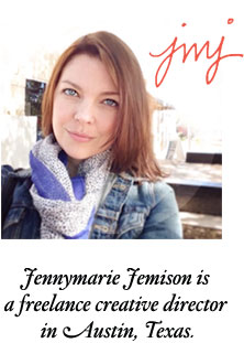
CLIENT: Jennymarie Jemison
MEDIUM: Branding, website, creative direction, illustration
PROJECT DESCRIPTION: What I've been doing since I last updated this website. Please check out my portfolio site for more current work.
I am now the creative director at Medicinal Media and also curate seed collections and other happy garden-inspired products at Joy Max Jardín. I am still accepting some client work so please get in touch if you’d like to work together. You can see a curated portfolio of recent work and greatest hits here.
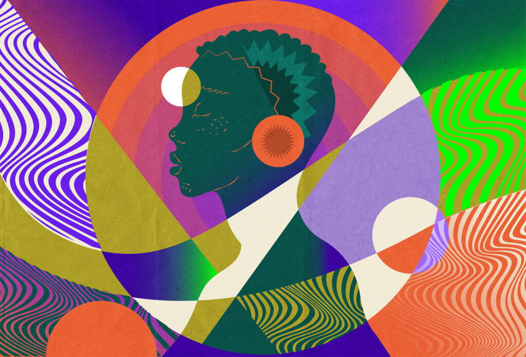
Working with artists like Neka King at Medicinal Media is a joy.
Shop Five and Four | 07.13.2018 Online Shop Fundraiser Launch
Click on the photo to enlarge or see more images
CLIENT: Five and Four Shop
MEDIUM: Silk-screened tees and baby onesies
PROJECT DESCRIPTION: The Five and Four online store launches as a fundraiser for family reunification efforts.
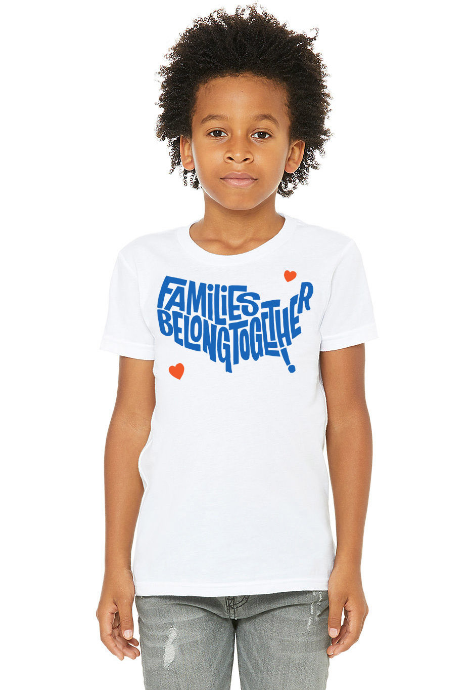
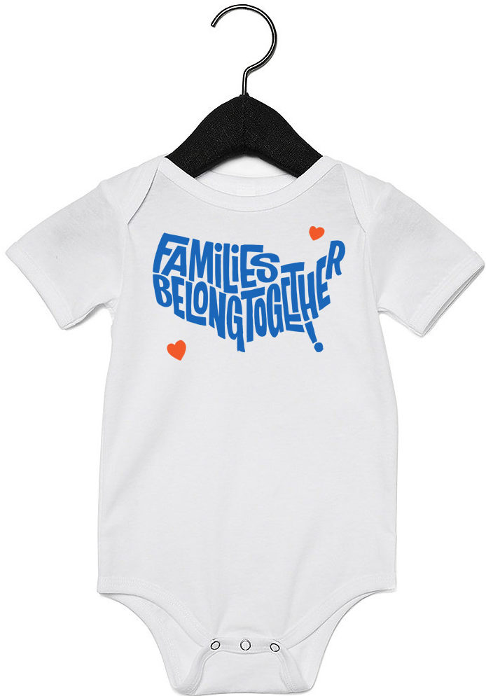
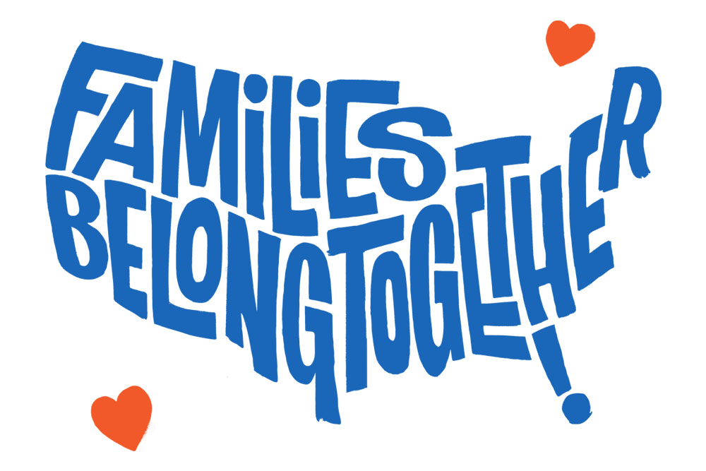 The day of the Families Belong Together march, I posted this original, hand-lettered map of the US to Instagram, and friends immediately started asking if it was available as a t-shirt. I’ve never had an online shop before, but that interest led to a scramble to get one up quickly to use a fundraiser to help support the efforts of those working so hard to unite the families affected by the brutal, and completely un-American zero-tolerance policy that has led to children being separated from their parents and other horrors. It took a little longer to get it all figured out and to source the softest, best-fitting t-shirts, but (unfortunately) the fundraising need is as urgent as ever.
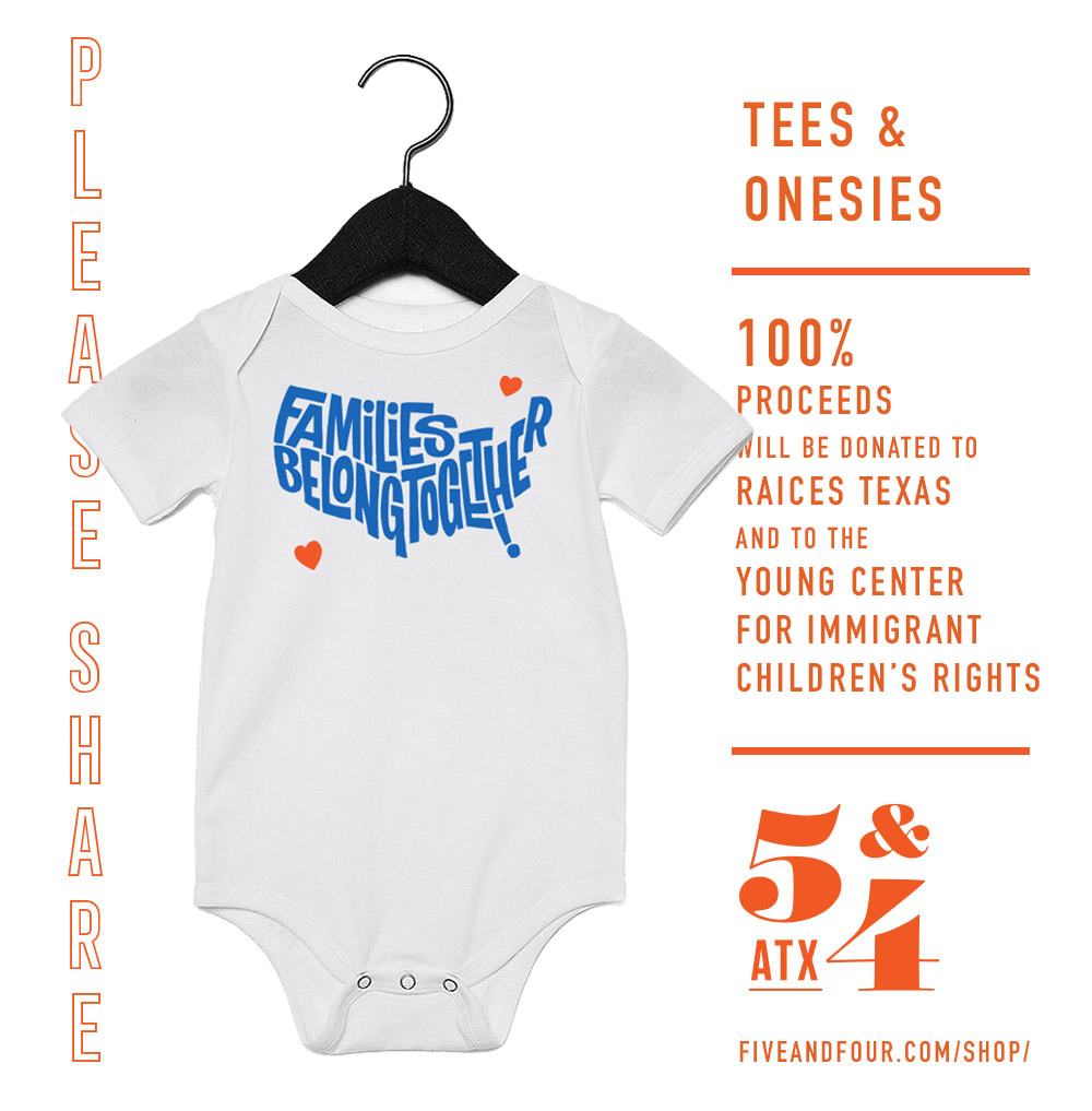
So today, I am proud to announce that the shop is open, and that ALL of the profits from these sales will be donated to RAICES Texas and to the Young Center for Immigrant Children’s Rights.
The color of the shirt is white, as the organizers of the Families Belong Together march asked protestors to wear the color as a “striking visual symbol that will also connect attendees in solidarity to each-other and channel historic social justice movements unified by one color of clothing.” It will be printed here in Austin. I am launching this as a pre-sale so that I can make sure no money is wasted in unnecessary inventory and more profits will be then able to be generated. That means fulfillment won’t begin until the first week of August, and shipping probably will start mid-month.
I know this is just a small effort, but I am proud to do whatever I can to help those that are doing so much. We won’t stop until every child is reunited and free. Please buy a shirt or two if you can, and share this campaign with your friends and family. This campaign will be a good indicator of how much good we can do in the future. Please support and share! – JMJ
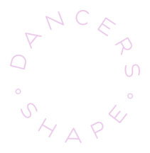
New Work | 09.01.2017 Dancers Shape Rebrand
Click on the photo to enlarge or see more images
CLIENT: Dancers Shape
MEDIUM: Branding, marketing collateral, web design, social media graphics
PROJECT DESCRIPTION: Rebranding of Dancers Shape, a local fitness studio focused on barre, pilates, yoga, and spin.
I’ve been in Austin for 11 years today! I really love this town and I love all the work I’ve been able to do for countless small businesses in this community. A lot of them I only became a patron of after I started working with them. Sometimes, they didn’t exist prior to our work together, or I didn’t know of them or their product. But when Ladyboss Jennifer McCamish cold-called me needing graphic design, and started describing her fitness studio, I already knew all about it. I’d been in a class there that same morning. I love love love Dancers Shape. It makes me almost believe that I too could have a dancer’s body if I just do enough butt lifts. All of the instructors are dancers, and the studio is welcoming and full of music and positive energy.
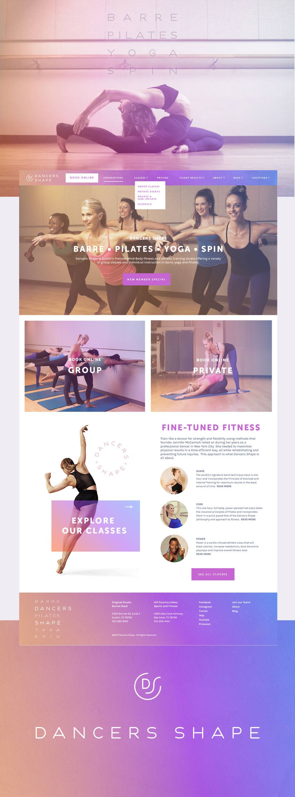
Originally, Jennifer just wanted a slight tweaking of her original logo just to add their new offering – spin classes – in advance of the opening of their new second location. I advocated for a complete re-brand. Knowing her studio the way I did, I made the case for a new look that represented something more modern, lighter, more fun, more dynamic. She was opening a second studio six years after the original opened, these publicity opportunities don’t come around every day. Thankfully, I convinced her, and the result is a dramatic refresh, full of color and versatility. It’s so much fun. I took my cues from how the signage for the original studio looks lit up a night. I took those neon colors and softened them a bit, but the result is very endless summer, hopefully inspiring those in search of that bikini body to come in for a class.
Jennifer was already in the process of updating the company website, so I also consulted on the project, designing the new look and feel that her team development implemented.


