New Work | 02.08.2016 Saving Face Branding + Website
Click on the photo to enlarge or see more images
CLIENT: Saving Face
MEDIUM: Identity, Print, & Website
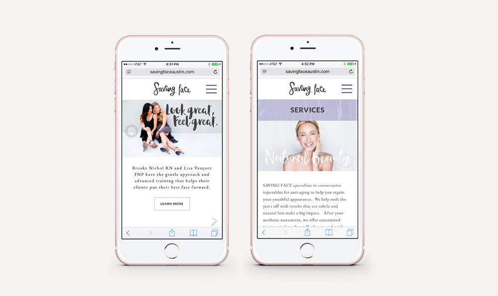
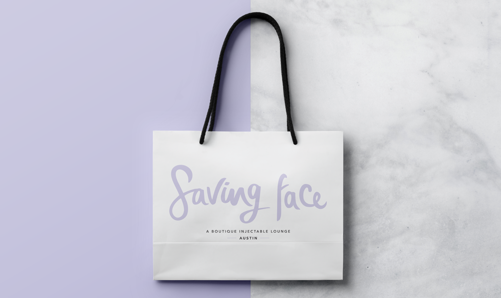
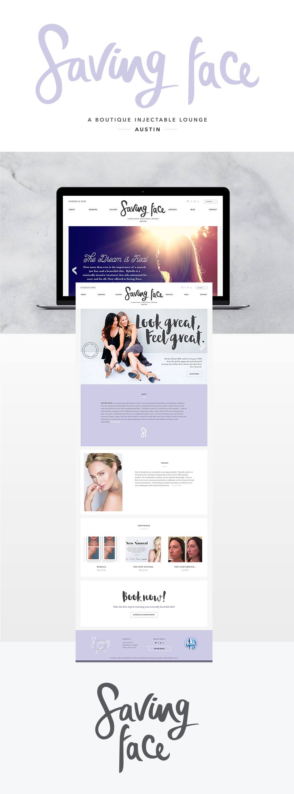
PROJECT DESCRIPTION: Hand drawn logotype and branding system for a boutique medical spa. Fully responsive original website design with a Wordpress CMS. Scroll down for more images.
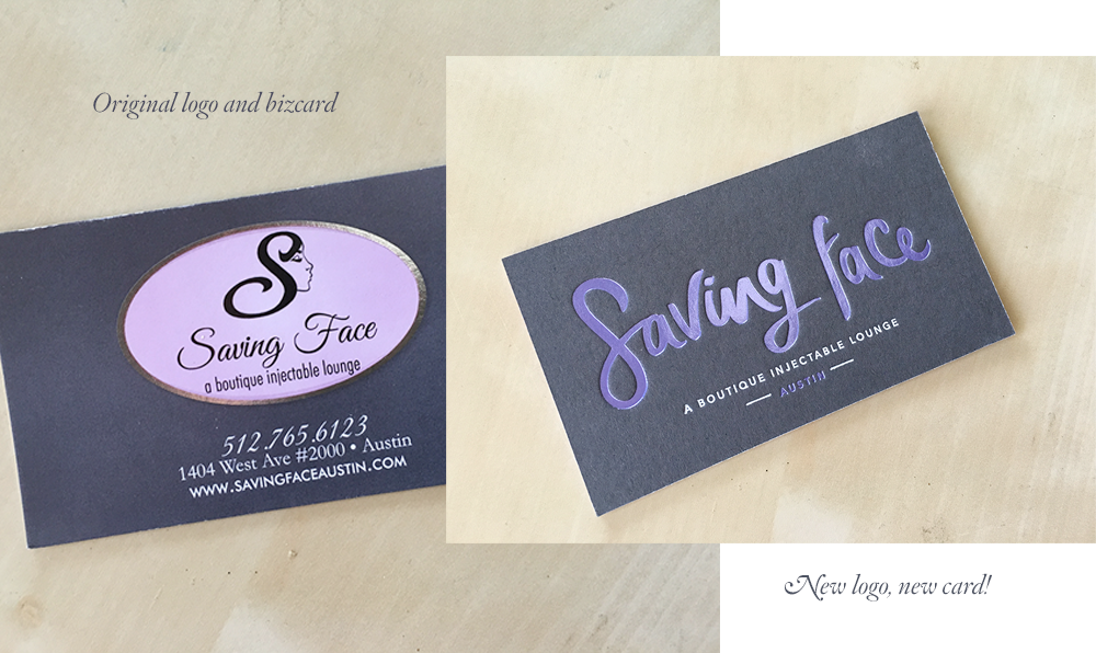
In a historic carriage house near downtown Austin, Ladyboss Brooke Nichol has been quietly dominating the botox game in Austin. Her philosophy is you that if you look good, you’ll feel good, and you’ll do good in the world. She is warm and beautiful, with a Mississippi drawl and manner makes you feel like you’ve known her for years. In our first meeting, we laughed as I told her the logo she’d been using since she opened reminded me of Truvy’s hair salon in Steel Magnolias and while it did reflect her southern roots, it didn’t covey the modern feel of her practice or her time in Beverly Hills, working with a plastic surgeon to the stars. Brooke is a RN. She and her staff wear scrubs in the office. And while you are in an environment in her studio that is calming and serene, they are, after all, doing injections, and there is a huge medical aspect to the work. Her clients want to know they are getting the most current application of the newest yet most trusted products, and that their results will be natural and not overdone or “plastic.” Brooke and Lisa have a completely personalized approach to each patient’s treatment, and thus the logomark needed to also feel personal. It is completely unique and hand-lettered. The lavender was already a part of Brooke’s branding, so we kept it. The website is clean and beautiful and fully responsive. Her new branding and website really sets her apart from others in the field. It has an almost editorial feel without becoming so fashion forward it alienates an older audience. Check out the video below to see the card in action.
See the full website here: savingfaceaustin.com


