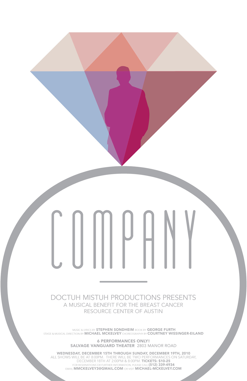
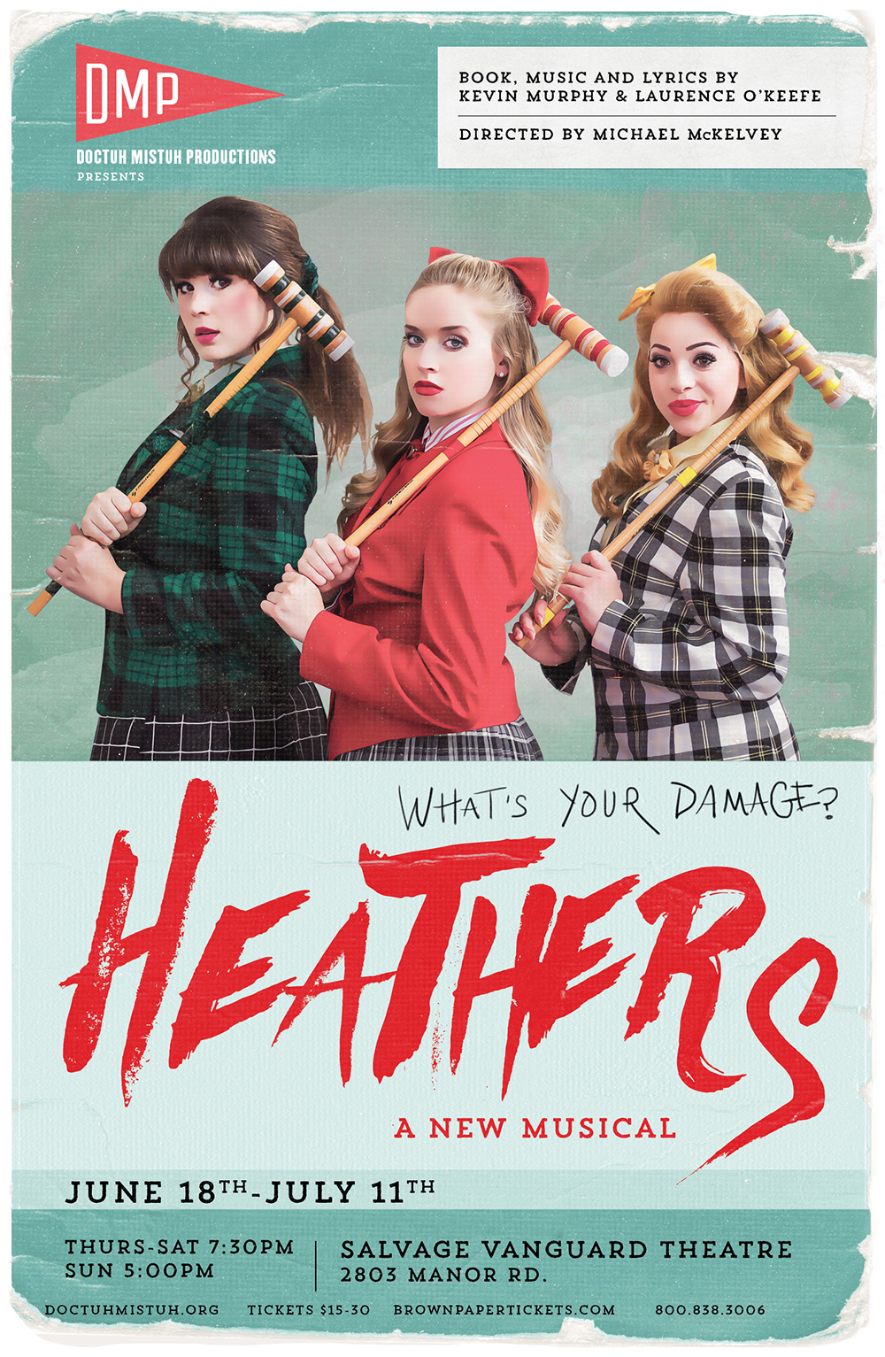
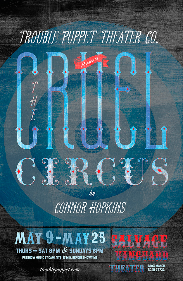
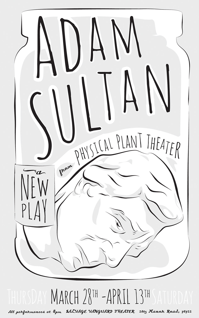
Austin | 06.23.2016 Salvage Vanguard Theater: Poster Design
Click on the photo to enlarge or see more images
CLIENT: Doctuh Mistuh Productions, Trouble Puppet Theatre Company, Glass Half Full Theatre, Physical Plant Theatre
MEDIUM: Posters and marketing collateral
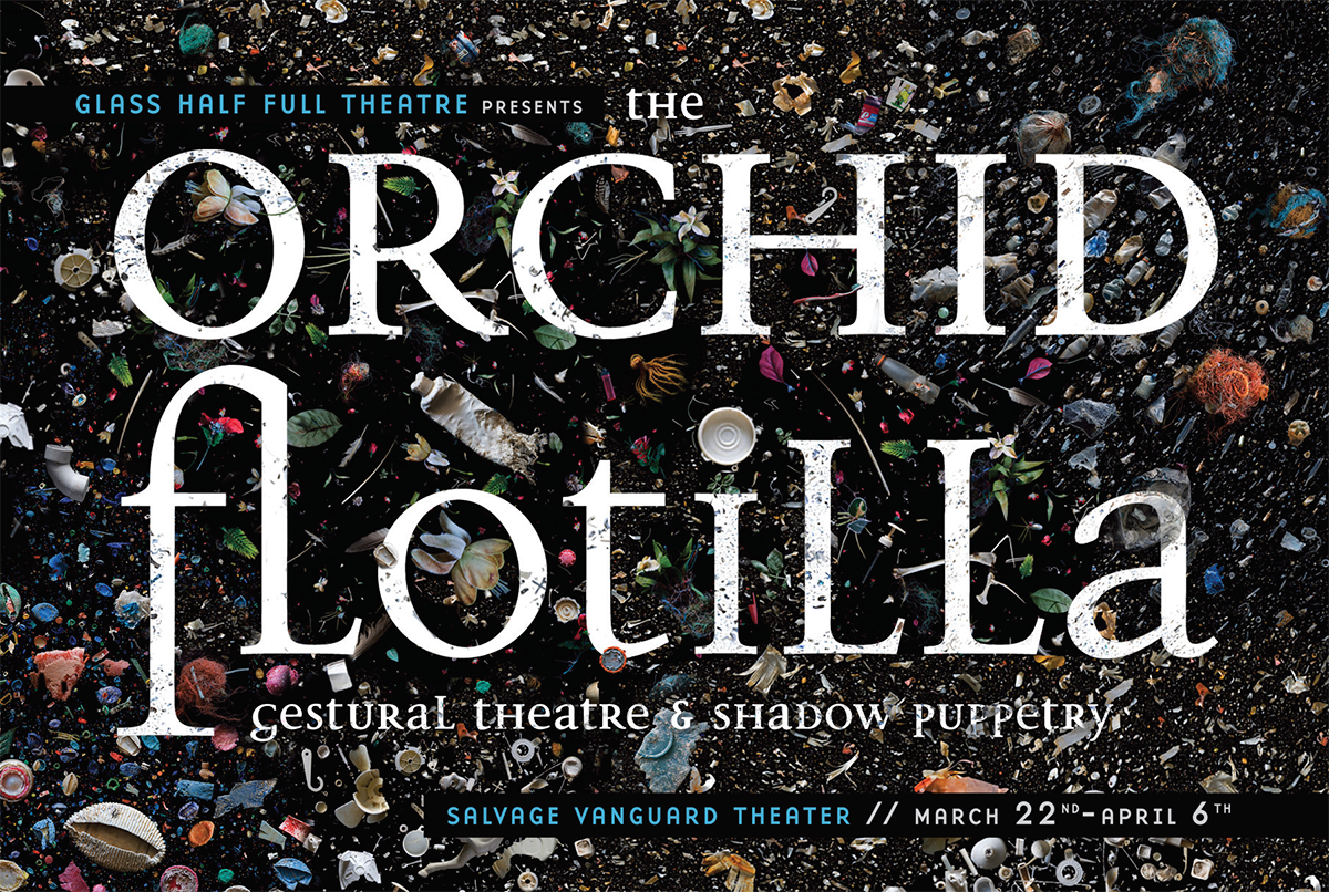
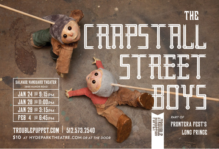
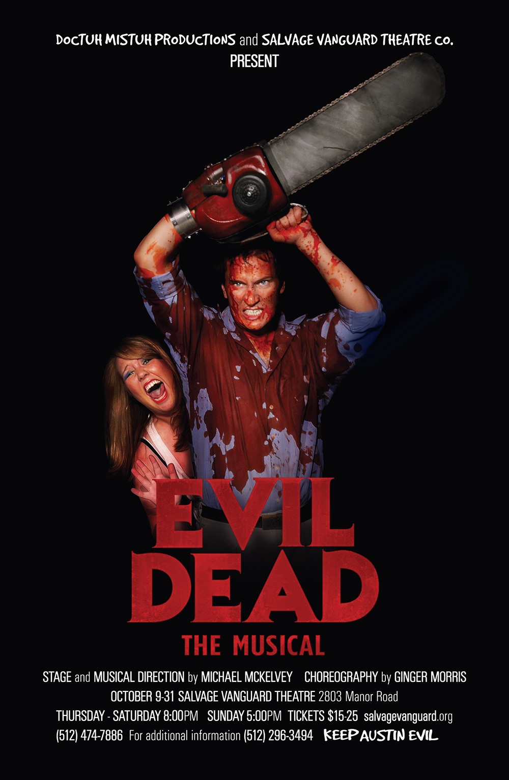
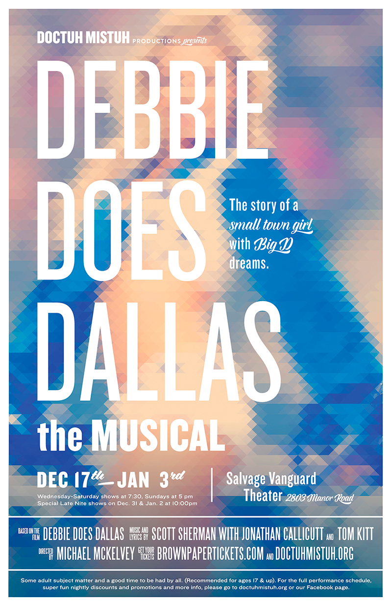
PROJECT DESCRIPTION: Posters for various productions performed at Salvage Vanguard Theatre
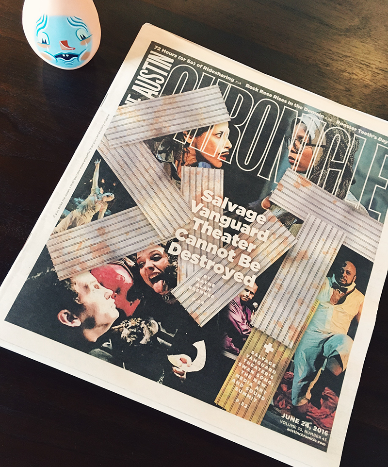
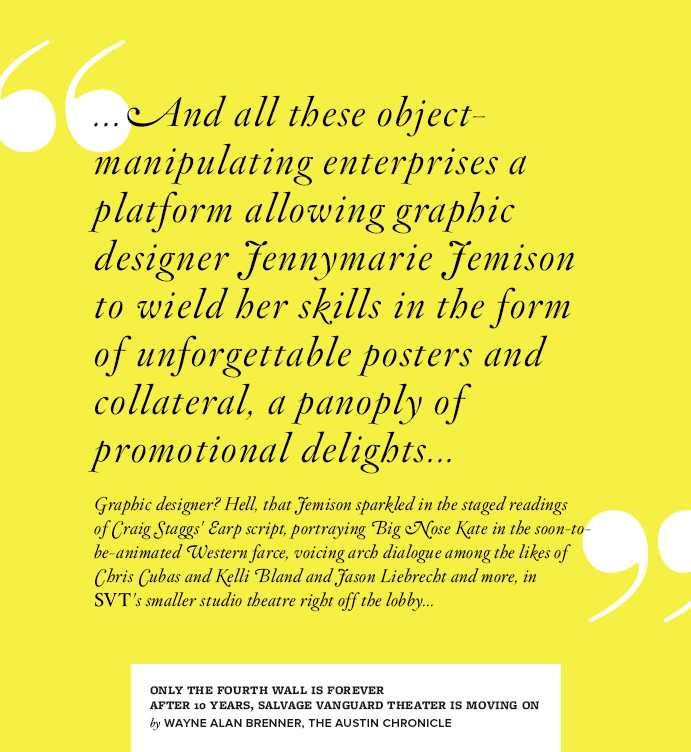
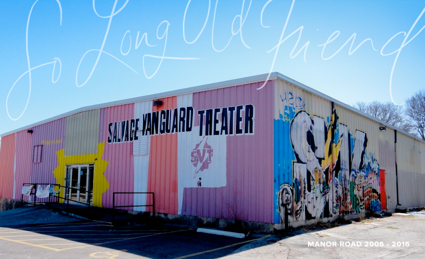
If you are an actor that does theatre in Austin, you’ve probably performed at Salvage Vanguard Theatre. The old warehouse space on Manor Road has been producing and hosting shows since 2006. Austin treasure and frequent champion of art and artists, Wayne Alan Brenner, wrote a love letter in this week’s Austin Chronicle to the space that is losing its lease, like so many other beloved Austin cultural institutions, at the end of the month.
I got caught in a mess of feelings this morning reading it. So many important moments happened there, including one of the best nights of my life. Brenner was sweet enough to mention me in the article, which speaks more to his generosity than to my contributions at the theater, but I have posted a series of some of my favorite posters I did for different companies that performed in the space, and I spent all day looking at old photos of performances there and getting all misty-eyed. Thank you for everything, SVT. Can’t wait to see what’s next.
New Work | 06.01.2016 Wine Label Design Contest Best in Show 2016, Austin & San Antonio
Click on the photo to enlarge or see more images
CLIENT: self-promotion
MEDIUM: print
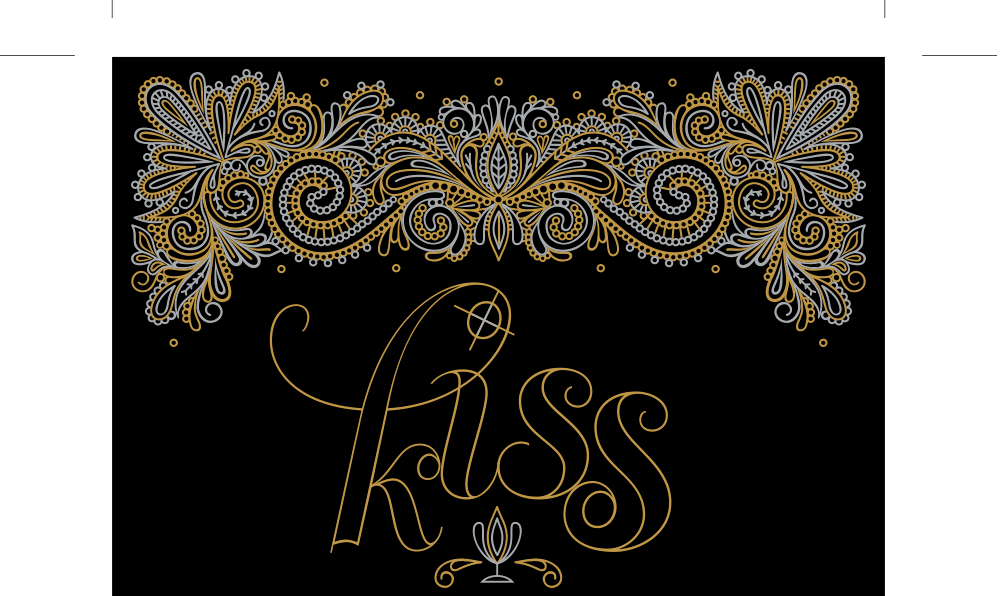
PROJECT DESCRIPTION: Wine Label design for Clampitt Paper Company
I don’t usually enter design contests. I actually can’t remember ever entering one, other than the Arkansas state fair art contests I used to enter my paintings in as a child. Mostly they were paintings of ducks. I was weird.
So it took a little encouraging from Jessica, my enthusiastic rep at Clampitt Paper, to convince me to enter their wine label design contest. “C’mon, you could win a trip for two to Sonoma, California! Your label would be printed on 600 bottles of wine!” I think before the second sentence I had started day-dreaming about it. So, I spent a little time re-purposing a design that had only been used on a wedding invitation suite which I was always very sad had the misfortune to be coupled with royal purple. I called it “Kiss Register Red,” which is an inside joke about color printing, describing when areas of color that touch without any overlap on the edges. Assumes perfect registration. – a kiss. But it also sounds romantic. RIGHT? I WAS GONNA WIN THIS THING!
The harder job was trying to find a way to print it on black paper. That actually turned out to be the big prize in all this effort, because, spoiler alert, I didn’t win the trip to Sonoma. The label did get Best in Show in the Austin and San Antonio contest, but lost ultimately in Dallas last weekend at a lovely event on White Rock Lake.
But back to the printing! Thanks again to Jessica, I discovered the HP Indigo 5500 press at Capital Printing, which can print white ink, and had the greatest experience with the folks there. The company president, Brad, gave me a tour, and took a personal interest in my little project. Zack, in production, explained they could print a few passes of white ink under my design which would allow me to print the gold and silver on top. This may not seem like a big deal, but believe me, it IS. So many cost-reducing, production possibilities for my clients! Plus, Brad basically gave me faith in humans again. They even donated their work, as they are very supportive of Austin artists. So, I just want to thank them here, for all they did for me. Even though ultimately, I should have maybe stuck to ducks. I did always win at the state fair.
New Work | 05.20.2016 Lauren Reynolds Photography
Click on the photo to enlarge or see more images
CLIENT: Lauren Reynolds Photography
MEDIUM: Print / Web graphics
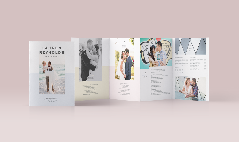
PROJECT DESCRIPTION: Rebranding effort for Lauren Reynolds Photography, featuring a hand drawn mascot pair of monk parakeets. Logo plus identity materials and media kit
When hiring a photographer for a wedding or special event, potential clients are going to primarily look at their work to make their decision. Ladyboss Lauren Reynold’s photos speak for themselves in that regard. In redoing the Lauren Reynolds Photography brand, I wanted to emphasize her personality and style. Before we were friends, I was her client. Hiring her was one of the best decisions I made in planning my wedding. But more to the point, I knew that her potential clients are evaluating, like I had, even if not consciously: Do I like this person? Do I think this person gets us? Do I like their style? Is there a sense of fun about them that will translate to our photos? The goal with this re-branding attempt was to elevate the look and feel of Lauren Reynolds Photography into a sophisticated and clean system of collateral and correspondence that also delivered on the personality front.
Lauren also told me that a large percentage of her clients hired her for out-of-town or destination weddings, and she would love to have more local Austin clients, so she wouldn’t have to travel as much. To tie her more to Austin, we created a secondary logomark based off the wild monk parrots found here. When you see a green parrot on a power line or somewhere you wouldn’t expect, it never fails to delight. They are truly something special and romantic about this city. We depicted two of them together, lovebird style, reflecting the couples that Lauren photographs.
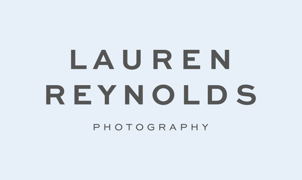
The main logotype is a clean, sans-serif, with the supporting initial mark based on Lauren’s own hand writing. The birds were drawn with markers and then digitized, for a very casual, sweet and unpretentious look and feel. The collateral uses fresh, minimal typography and color blocking, which really helps Lauren’s photos shine. I really love the result.


