New Work | 04.17.2017 The South Terminal
Click on the photo to enlarge or see more images
CLIENT: Lonestar Airport Holdings LLC
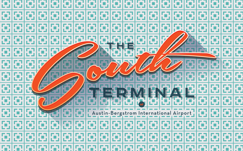
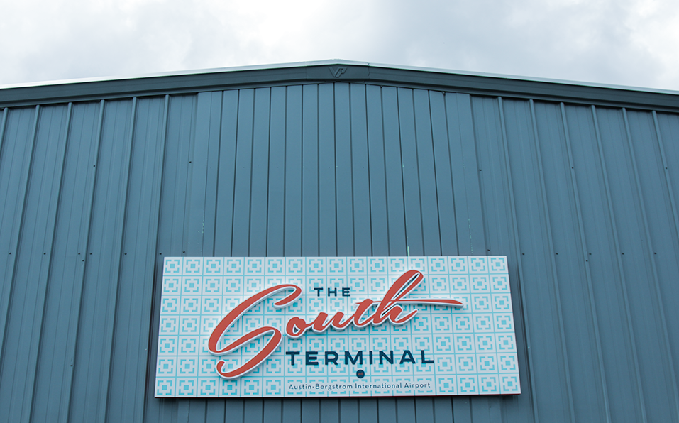
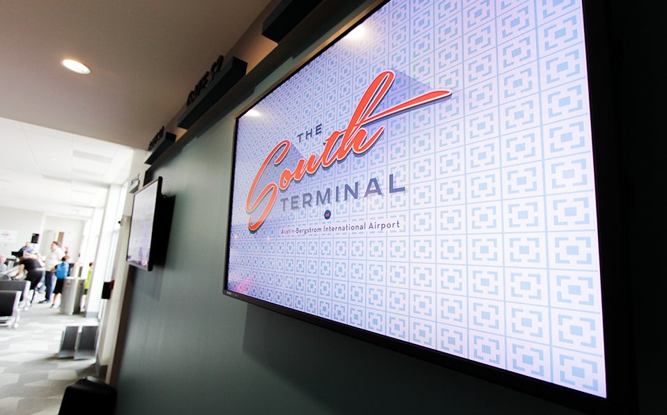
MEDIUM: Logo and Identity suite, responsive website with custom CMS: www.austinsouthterminal.com
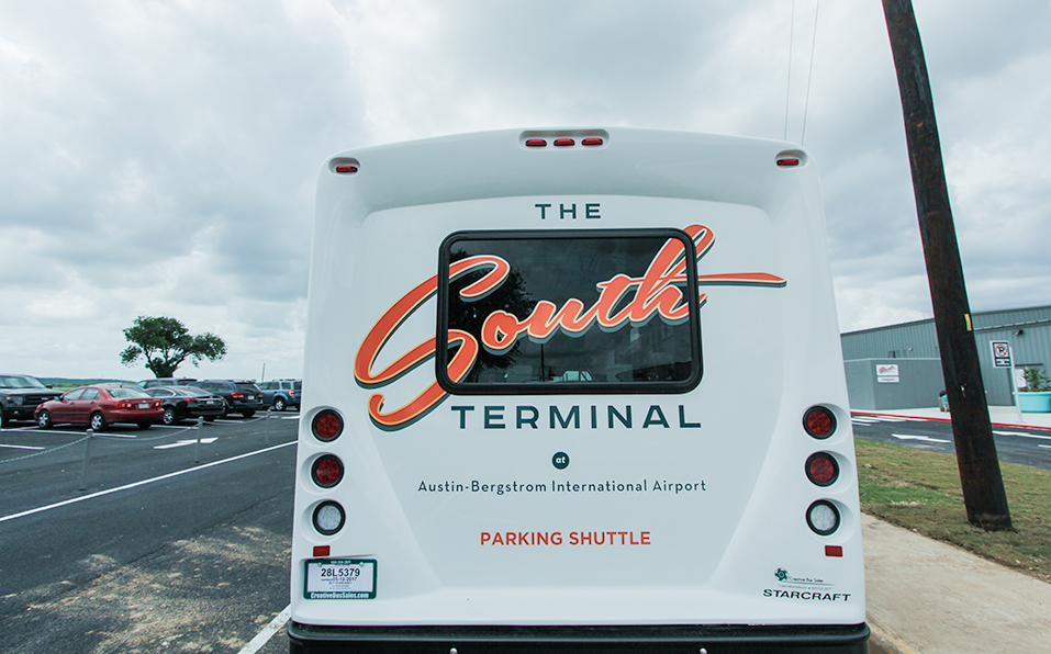
PROJECT DESCRIPTION: Branding and website for The South Terminal at Austin-Bergstrom International Airport
Being in the design field, you have to accept that the work you do is mostly ephemeral. Websites get updated, products disappear from the market, businesses close up shop and your work disappears with them. It’s a part of the job you have to accept, although it always hurts a little. So you have to understand that for me, this job is one of the most thrilling projects I’ve ever had the good fortune to be a part of. The South Terminal at Austin-Bergstrom International Airport opened to passengers last Thursday, and I was there for it, grinning like an idiot, over the moon to see my work not only displayed but integrated throughout what I hope will remain a fixture of Austin’s infrastructure for decades to come.
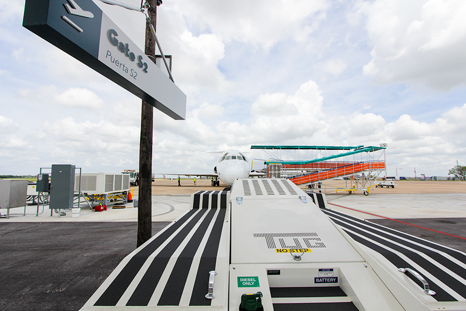
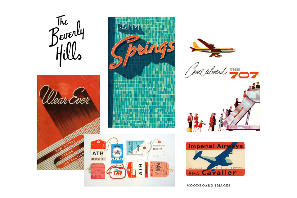
I never expected to get this job. I was asked to submit a proposal, but I knew I was bidding against much bigger agencies, many out of NYC, and while I assumed it was a lost cause, I wanted it so badly that I put a lot of time into the proposal, describing an aesthetic for the look and feel that hearkened back to mid-century design and the golden age of travel. Little did I know that that was already the look and feel for the renovation. The South Terminal at ABIA is very small. It’s designed so that you exit the gate and walk out on the tarmac to board your flight. It’s very Mad Men, or Catch Me if You Can. And that’s exactly what I described in my proposal. A lucky case of kismet to be sure, because it landed me the job. And after that, it really was a breeze as projects go. Rarely are you so in sync with a client from the get go. In this case, even before the get go. And now that’s ended, I can’t wait to visit again, but this time as a passenger, for years and years to come.
Find out more about the Austin’s South Terminal at ABIA and see the website we designed for them here: austinsouthterminal.com and you can read a write up by Wayne Allen Brenner for the Austin Chronicle of this work too! Very cool to be recognized for it. <3
New Work | 03.05.2017 2017 Texas Film Awards
Click on the photo to enlarge or see more images
CLIENT: Austin Film Society (a collaboration with Arts + Labor)
MEDIUM: Print, interactive, motion graphics
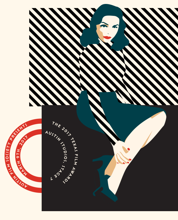
PROJECT DESCRIPTION: The look and feel for a black tie gala, including all branding elements, advertising, web graphics and print collateral
For the second year in a row, I have had the honor of working with Arts + Labor and Austin Film Society to art-direct the Texas Film Awards. This is the biggest night of the year for Austin film. The gala raises funds that are used for Austin Film Society’s filmmaking grants, programming, and educational efforts for the next year. The ceremony also inducts industry icons into the Texas Film Hall of Fame.
On a personal level, this is my favorite job of the year. I feel very grateful that sometimes my work in film and design overlaps. This is the biggest example of that happening. At last year’s event, Carol Burnett was inducted into the Texas Hall of Fame, and seeing her on the red carpet next to the logo I designed was one of the all time high points of my career.
The theme this year references pre-war cinema: Anti-Heroes,
Femme Fatales, Futurist constructions, The Dream of Cinema. It’s a special year in that AFS is opening a two-screen art house cinema in 2017. This was announced from the stage last year by Richard Linklater during the awards, and now it’s happening. There is a really cool fundraising campaign to fund the Best Little Arthouse in Texas. Give if you can. You could get free popcorn for a year!
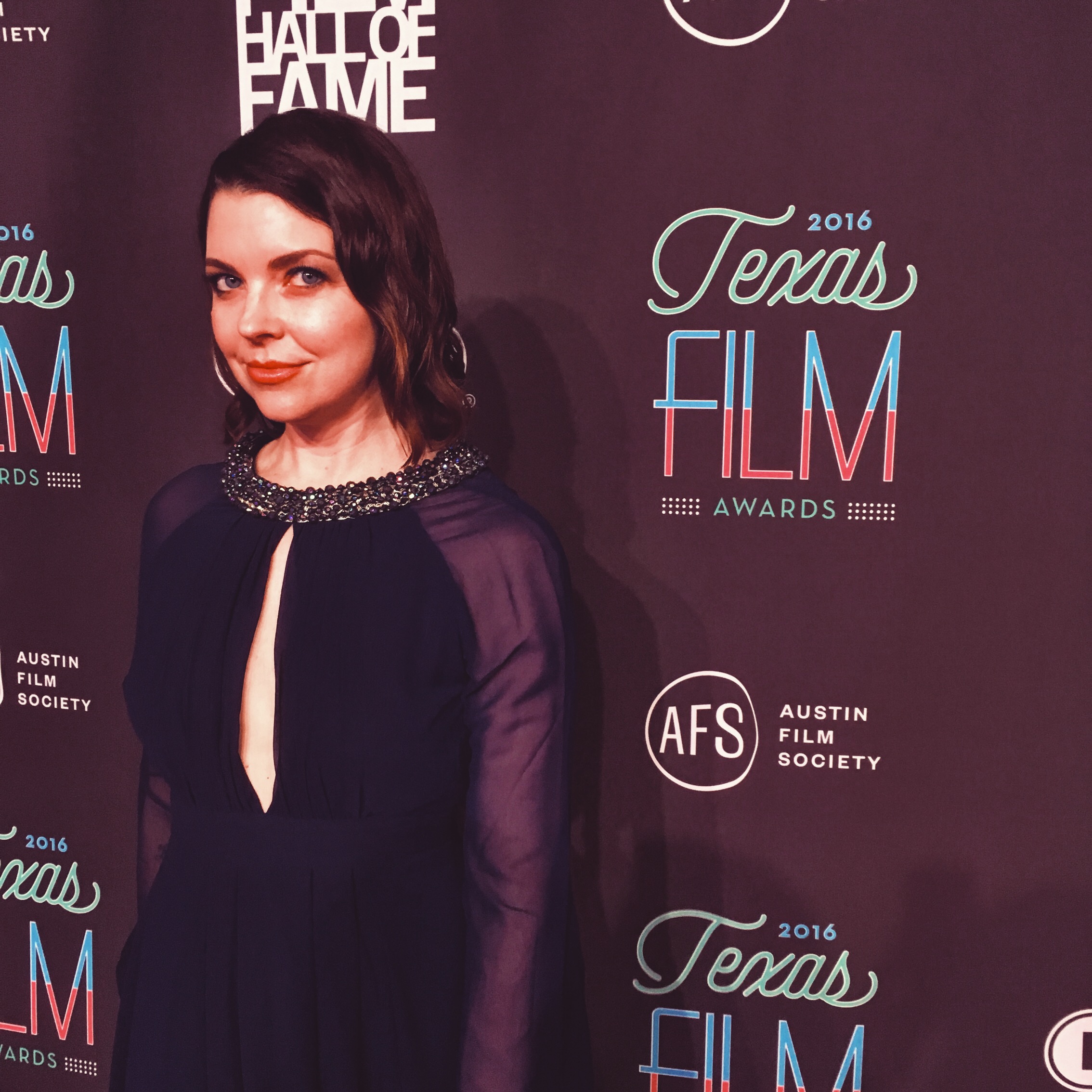
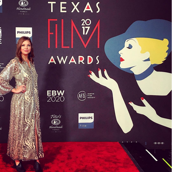
Since my friend and photographer ladyboss, Lauren Reynolds Logan, was there too, I couldn’t help but ask to get a pic myself on the red carpet. It was all I could do to not grin like a maniac. I hope I’ll see you there this year. The honorees have just been announced, and I am SO EXCITED.
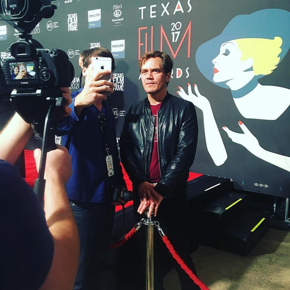
UPDATED: Red carpet images from 2017.
(MICHEAL SHANNON I DIED.)
New Work | 12.07.2016 Graham Reynolds Website
Click on the photo to enlarge or see more images
CLIENT: Graham Reynolds
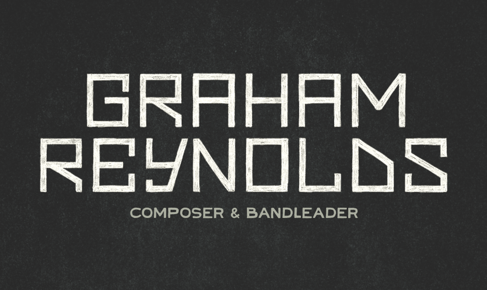
MEDIUM: Responsive Website Redesign; WordPress back-end; hand-drawn logo
PROJECT DESCRIPTION: grahamreynolds.com
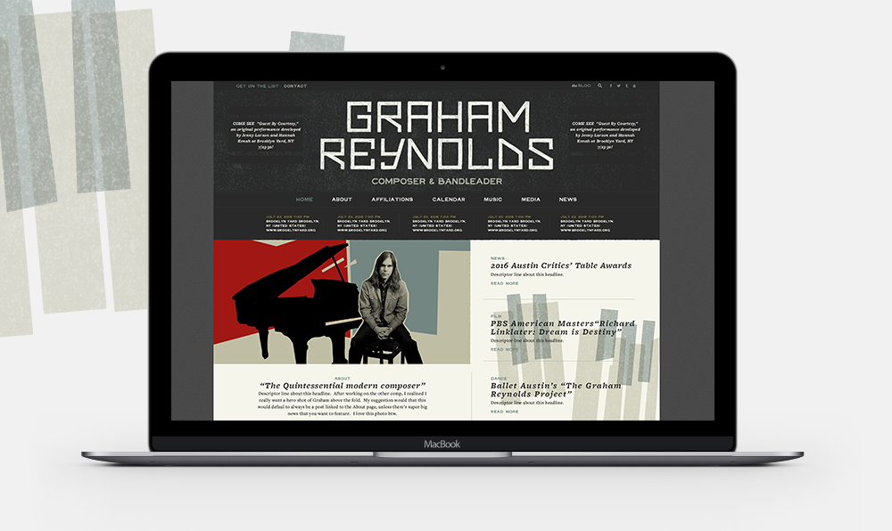
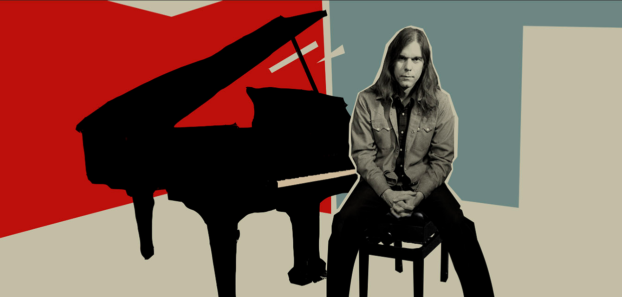
Redesign of Graham Reynold's website, which needed to to serve as a hub for all his social media feeds, tour dates, new material releases, and all the many many projects he is working on at any given time.
Is there an artist more important to Austin than Graham Reynolds? Only Richard Linklater ranks up there in my book. The way I measure their importance is not just the impact their work has on the city, but also the others they lift up with them. As one of my heroes, Ava DuVernay, says “If your dream only includes you, it’s too small.” Graham is generous with his talents, and his talents are generous. He is a composer, a band-leader, and plays a multitude of instruments. He likes destroying them. Designing his website was an honor.
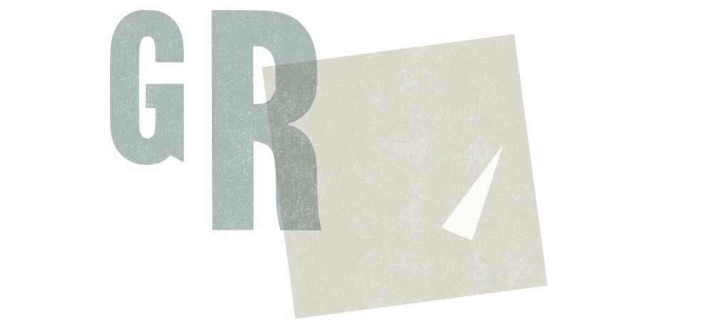
Graham had very specific ideas about how the site should function. He recommended a flow similar to a news or sports page, which makes a lot of sense as it needed to be a hub for all his social media feeds, and all the wide ranging work he creates for film, theatre, television, and dance. He loves the work of Saul Bass, whose influence you can see on every page in the shapes we created and the typography throughout. We needed news items and tour dates to be easily accessed. We also needed to make it function as a press kit and media inquiry delivery system, and with all that going on, it needed to be cool. He didn’t tell me that. But he’s so cool, if his site wasn’t cool, I would consider myself an abject failure. Thankfully, I think we succeeded.
This site was one of my last projects of 2016. This year has been so hard in so many ways, but I have been so very lucky to have such incredible clients. I want to thank all of you for trusting me with your business which, like this one, is sometimes an extension of yourself. It humbles me, and I will always be grateful.
See the whole site here: grahamreynolds.com


